Answering the question
Example 3
This is a double-page spread (two facing pages) from the magazine, Automotive, written, designed and published each year by students of Coventry University’s Automotive Journalism MA programme.
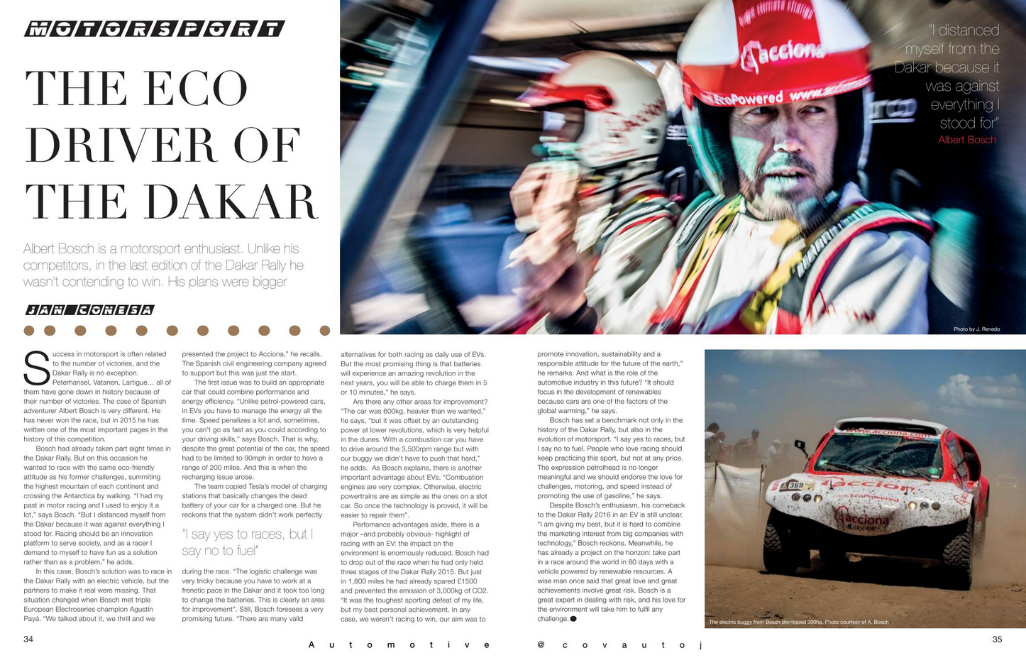
To make the text clearer, we’ve labelled the presentational features on each page of the spread individually below:
Firstly, follow the procedure as in examples 1 and 2, writing down the four main headings for presentational features:
Layout
Pictures
Colours
Text
followed by the four main headings for presentational feature effects:
Understand
Sense
Respond
Remember
Again, consider each of the presentational features and make your notes. At the end of each, write down what effects the features have had on you.
Answering the question
Remember, the question will be something like:
“Look at the source ‘The eco driver of the Dakar’ and define the ways in which presentational features have been used for effect.
Remember to:
- write about the way the source is presented
- explain the effect of the presentational features”
Here’s how we answered this question:
Brief introduction
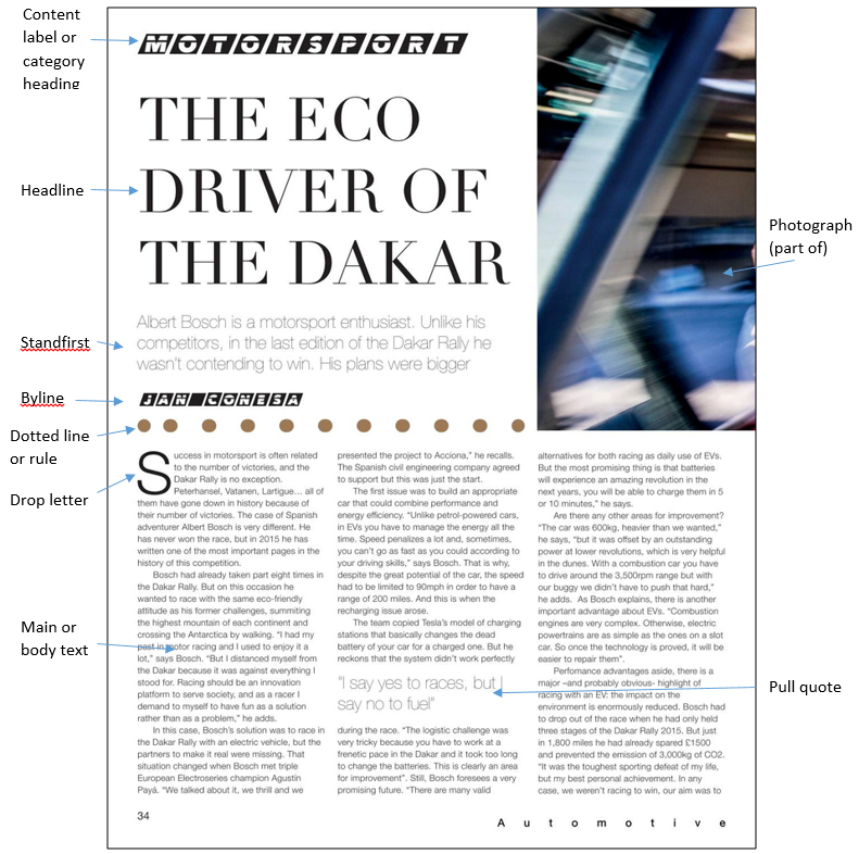
This two-page spread from a magazine written and designed by automotive journalism students is aimed at a sophisticated audience of motoring and motor-racing enthusiasts. It has a look of quality about it, due largely to the classy-looking serif font used for the headline and the restrained, yet still impactful, layout. The most striking element of the layout is the main photograph, which looks as if it has been zoomed during the exposure to give an overall impression of speed and vitality.
Presentational device: layout
The layout is restrained, yet still has lots of impact due largely to the big picture, which is suggestive of speed and action. Apart from what I think is a rather ill-considered “blobby” line or rule immediately above the first two columns of text, the colour is provided by the two pictures. The white space on this spread works well – coloured text and boxes might have distracted from the photos. The layout is eminently easy for the reader to follow. The limited number of fonts creates harmony rather than the discord of multiple typefaces. A four-line drop letter is an effective start signal at the start of the text proper, and the blob at the end of the text clearly indicates “end of article”, so the reader doesn’t have to turn the page to ensure the end has been reached. The four columns of text are the right width for easy reading and one leg is broken by one of the two pull-quotes to give a visual break.
Effect: Understand, sense, respond, remember
The layout affects all aspects of our interaction with the pages. Clarity and logical positioning of page elements help readability and therefore understanding; the fonts and use of white space affects our senses – I feel this spread has an upmarket look about it; the reader is very likely to respond by reading the article; and the accessibility and ease of reading should help the reader to remember many of the details.
Presentational feature: text – content label
The “MOTORSPORT” label above the headline gives a clear indication of what the content of this spread is about. It is italicised, giving it a “racy” look, and reversed (white on black), each letters having its own black parallelogram. The letters each have a horizontal black line cut out of them.
Effect: sense, understanding
The overall effect is to suggest speed – entirely appropriate for a motorsport page. It helps initial understanding by clearly labelling the spread as “motorsport”.
Presentational device: text – headline
The headline, in a classy serif font, lends a tone of seriousness and sophistication to the pages. It is in capital letters, which adds to its impact even though it is not emboldened, and is big enough to be very noticeable without compromising the power of the main picture.
Effect: sense, respond
The headline has two obvious effects: its typography speaks to the senses, suggesting that this is a sophisticated magazine; and it leads the reader into the standfirst and the main text – precisely the response that the page designer was looking for.
Presentational feature: text –standfirst
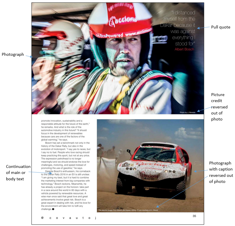
The standfirst, which teases the reader, making him/her wonder why a rally driver would NOT be trying to win a major event, is perfectly positioned and the right length (i.e., brief) to draw readers in and make them want to read more. The sans (no serifs) font contrasts with the headline. It harmonises well with the two pull-quotes, one in the second column of text, the other reversed out of a “dead” area of the main photograph.
Effect: respond
It leads readers to the main text, and makes them want to read more.
Presentational feature: text – by-line
The by-line (the name of the article’s writer) is the same style as the “MOTORSPORT” content label, although smaller. It works well as a breaker between the standfirst and the main text, and leaves an area of white space to its right.
Effect: sense
The style of type employed for the by-line suggest speed and dynamism (as per the content label), and the space to the right of it helps to provide an overall uncluttered feel.
Presentational feature: line or rule
The dotted line or rule above the first two columns of text is the weakest design element on this page. Why is there less space between the first two dots than the others? Perhaps it’s intended as a visual metaphor for acceleration; if so, it will be lost on most. The rule seems out of keeping with the rest of the page – an unnecessary and, frankly, rather cheap-looking accoutrement.
Effect: Sense
This dotted rule is intended to add visual interest to the page, but my own opinion is that it brings down the tone.
Presentational feature: text – main or body text
The drop letter is a great start signal for the reader, while the body text font is sans, in contrast to the headline, and very clear and legible. The division into four columns (three on the left-hand page of the spread and one on the right) makes for optimum line length, making the text easier to read. The paragraphs are the right length – short enough to avoid reader fatigue, and long enough to avoid a plethora of left-hand indents. The layout ensures that the columns are around half the length of the page – columns that run most of the length of the page can be off-putting for some readers.
Effect: understanding, remember
Ease of reading, due to the size and shape of the main text, aids understanding and makes it more likely that readers will remember what they have read.
Presentational feature: text – pull-quotes
There are two pull quotes, each used in a different way. The first, positioned in the second column of the body text, is a breaker that provides effective visual relief. The second makes use of part of the negative space in the main picture.
Effect: sense
The pull-quotes, although informative in the sense that they highlight something significant that the interviewee said, are primarily visual devices and help make what is otherwise a very restrained layout more interesting.
Presentational feature: photographs
The main focus is on the interviewee, Albert Bosch, who is seen in the main picture along with his co-driver. While Bosch’s facial features are quite clear, the rest of the photo is blurred by a zoom effect. This really does focus attention on Bosch, while the zoom effect adds a sense of speed and vitality.
The second photo is of Bosch’s electric buggy taking part in the Dakar Rally. It is whipping up a mini sandstorm and is covered in the dust and detritus it has picked up en route.
Both photos have been taken very professionally. The bigger one is the main presentational feature of this spread, outdoing the headline as well as the smaller picture below. Because there is no other colour on this page (apart from some rather ill-considered brown blobs) the colour of the images really stands out.
Effect: understanding sense, remember, respond
The photos help with understanding, showing what Albert Bosch and his car look like; the colour and overall impact of the photos give a sense of speed and adventure; seeing the car and driver aids memory; and they bring a response from the reader, who wants to find out more about this man and his rather strange-looking rally car.