Standard deviation
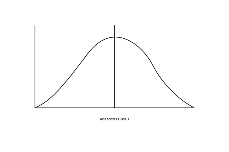
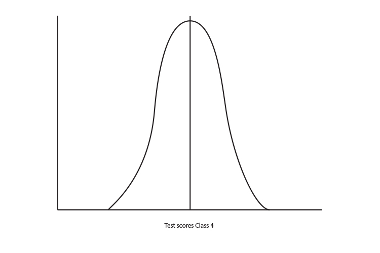
The graph below shows a thousand students taking a test in Class 3 and Class 4. You can see nearly 150 students got a score of between 80 and 90 marks in Class 3. In class 4 nearly 250 students got a score between 80 and 90.
Lets look at the mean (add up all the numbers and divide by the number of numbers) of the following graph.
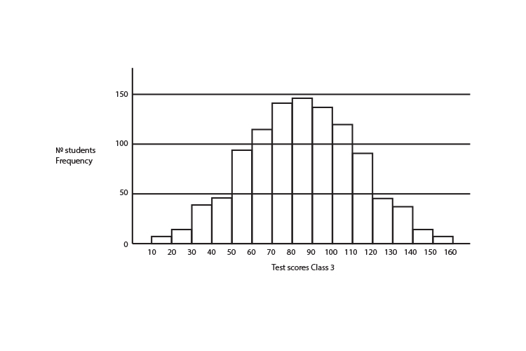
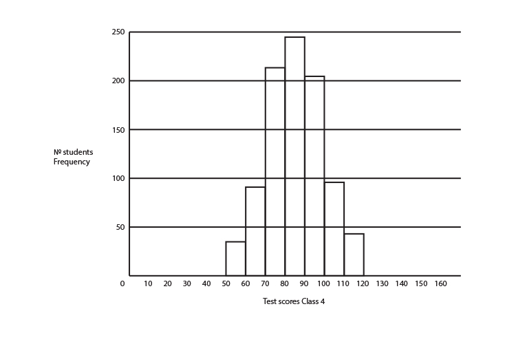 The mean of the test scores for year 3 is 85 and the mean of the test scores of year 4 are also 85.
The graphs have the same mean value but very different distributions.
One way to show the differences in these graphs non graphically is to give you a number that tells you how far away 68% of all the data is from the mean (called 1 standard deviation).
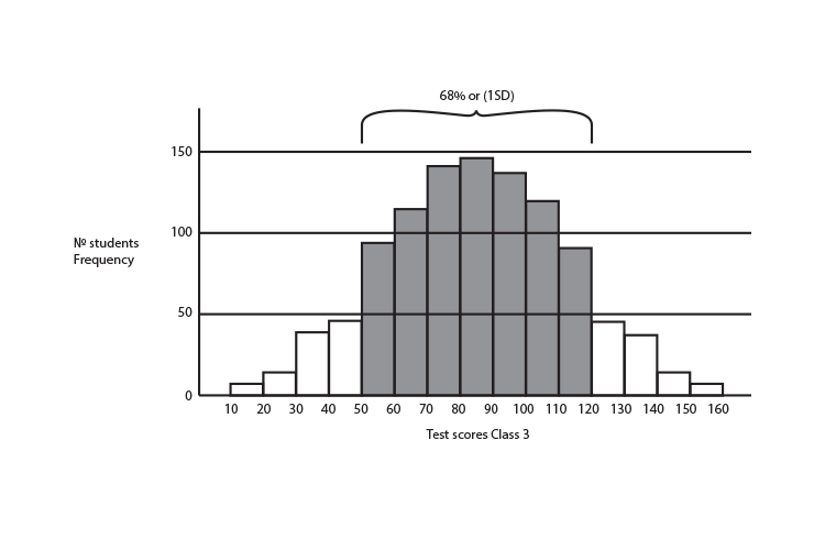
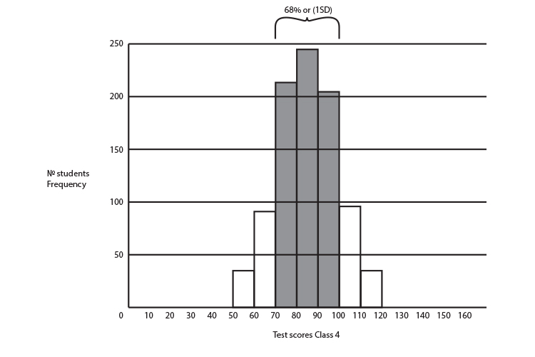
This only works for graphs that have the shape of a bell, or a bell curve.

The mathematical name for this bell curve is "normal distribution" where the measurements tend to cluster around the mean and tapper off at the edges.
So the curve of the two graphs above would look like:
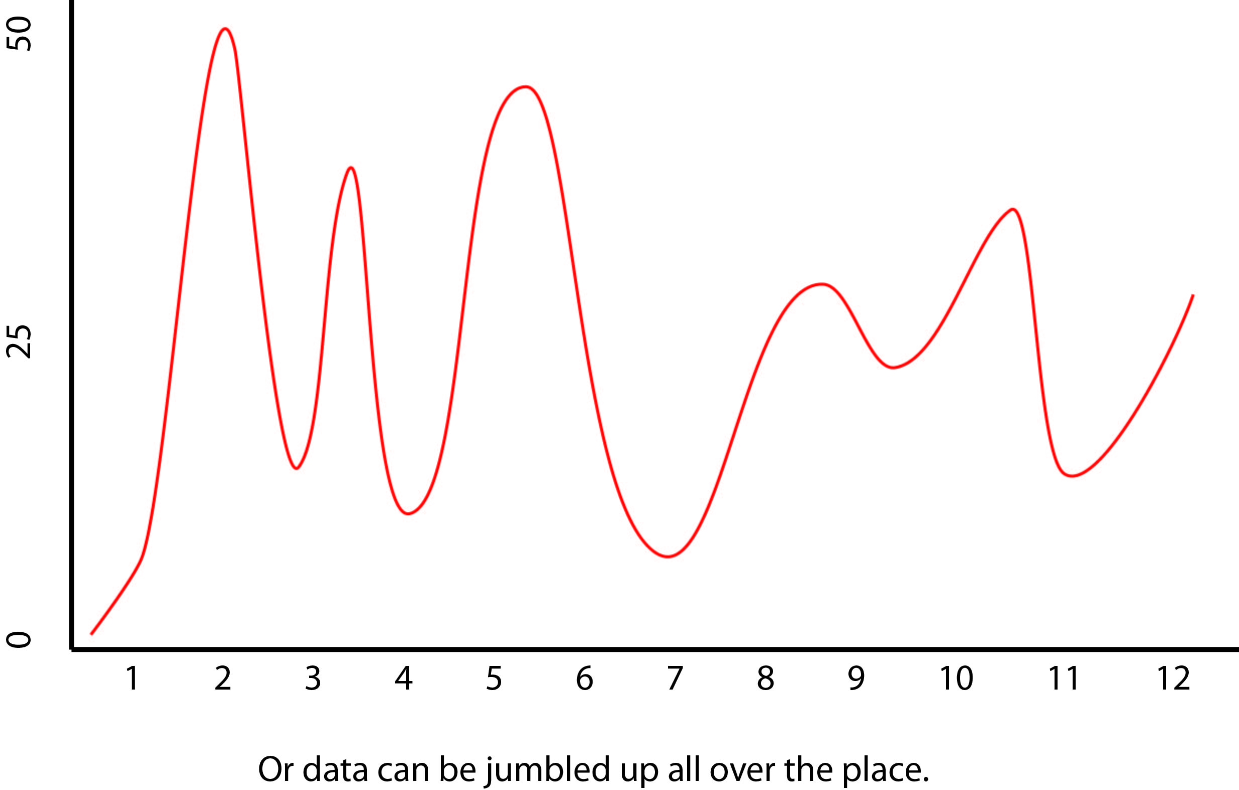
This form of expression using the words "standard deviation" only works for this normal distribution or bell curve. It would not work for any curve that was skewed as:
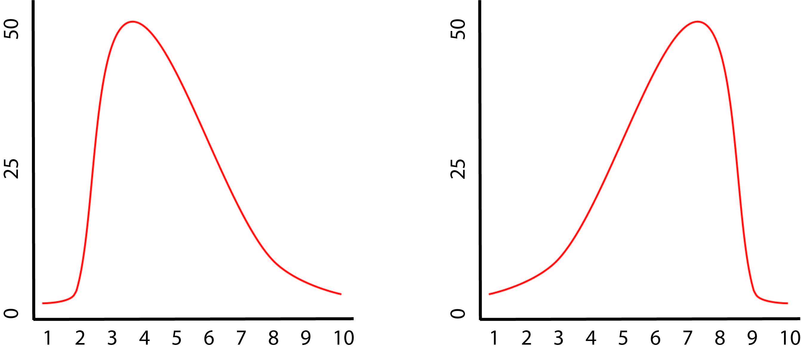
Or
So taking the two graphs above and expressing them as a curve:
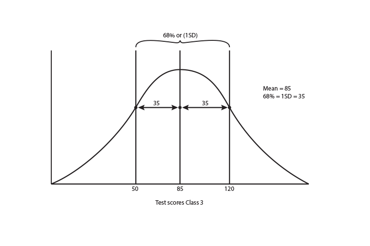
The 68% (1 standard deviation) of Class 3 = 35
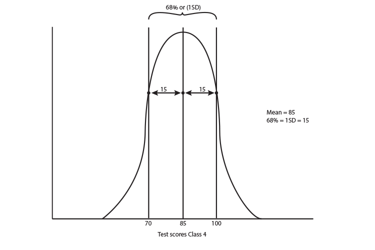
The 68% (1 standard deviation) of Class 4 = 15
As follows graphically:
So if you compare
Class 3 mean = 85 and 1 SD (standard deviation) = 35
Class 4 mean = 85 and 1 SD (standard deviation) = 15
You can tell just from the numbers that class 4 has a much more concentrated cluster around the middle than class 3.
The teacher in class 3 may need some extra help for the wide spread of distribution of kids in her class.
More help may be needed for the not-so-highly scoring kids and even more help perhaps for the really smart kids who need extra help to push them on. The graph is so diverse they certainly can't be taught in the same way. Whereas with class 4, the teacher may have a better chance to bring all the kids through together.
All this just from the numbers.