How do you decide what typeface to use?
Serif type is generally thought to lend a serious, more sophisticated look to the text both on screen and in print, which is why so-called quality newspapers use serif fonts for headlines, while the brasher tabloid newspapers opt for sans.
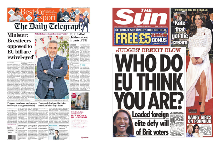
“Serious” newspapers tend to use serif fonts for headlines; popular newspapers usually opt for sans.
However, when it comes to the main text, or “body text” of an article, practicality supersedes appearance. At smaller sizes, serif fonts are generally easier to read because the serifs make the letters more distinctive and easier for our brains to recognise quickly. This is why, for instance, most newspapers and books use serif fonts for body text.
Main text, or body text. Note - this text starts with a “drop letter”, which is a signal for the start of the main text.
There is a huge range of font designs in both serif and sans serif forms. Some fonts are narrower than others (so each individual letter needs less linear space), and these may be used where the number of words you can fit into a given space is a major consideration.
There are “fun” fonts like Comic Sans:

And fonts that look like handwriting, such as Caflisch Script:

Editors and page designers choose fonts to match the overall style, tone and audience for what they are producing, but legibility – the clarity or “readability” of the text – is generally a prime consideration.
While it’s obvious you would not print an obituary using Comic Sans, other choices may not be so easy, particularly as many fonts look quite similar to each other, at least at first glance. This is where the choice often comes down to personal taste.
NOTE: There are actually a few fonts that are not letters and numbers – for instance, Wingdings is a symbol font, in which each character is a kind of image. The following is what you get when you type QWERTYUIOP (the top row of letters on a keyboard) using Wingdings: