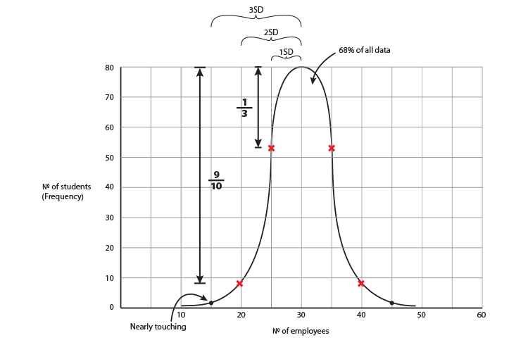
Sketch the bell curve
When you are told the standard deviation, the mean and the highest frequency of a set of data you should be able to sketch a pretty accurate reflection of events.
Here are examples:
Example 1
Farmers were asked how many people they employe.
The mean was 6
60 of the farmers had 6
and the standard deviation = 2
To build the graph draw the `x` and `y` axis and locate the top of the graph.
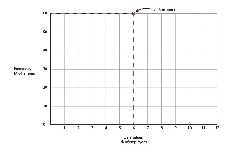 If 6 is the mean that is the top of the graph and because 60 of the farmers had 6 employees, 60 must be the highest frequency.
Now we have located the top of the graph. We can now work out the impact of a standard deviation which is 2.
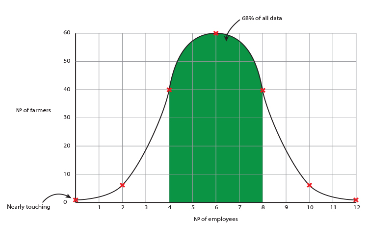
2 either side of the mean = 68%
4 either side of the mean = 95%
6 either side of the mean = 99.7%
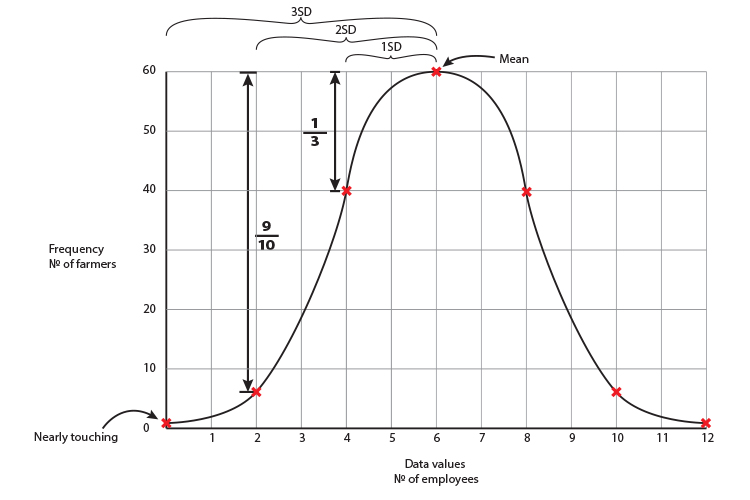
This graph gives you a good rough guide as to how the data should be interpreted.
Example 2
Students were asked how many hours of TV they watched per week.
80 students watched 30 hours per week and 30 hours was also the mean. The standard deviation was 5 hours.
Draw a rough sketch of the bell curve:
To build the graph draw the `x` and `y` axis and locate the top of the graph.
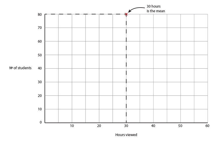 If 30 hours is the mean that is the top of the graph and because 80 students watched 30 hours, 80 must be the highest frequency.
Now we have located the top of the graph we can work out the impact of a standard deviation which is 5 hours.
5 hours either side of the mean = 68%
10 hours either side of the mean = 95%
15 hours either side of the mean = 99.7%
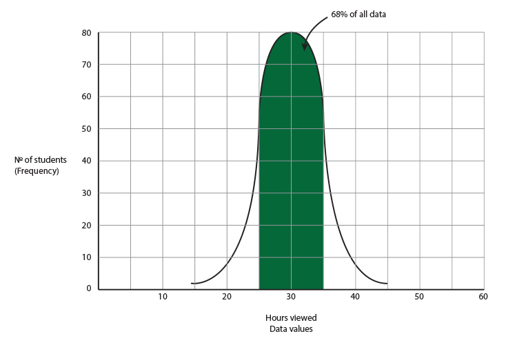 This graph gives you a rough guide as to how the data should be interpreted.