How to answer the question on presentational features
Example 1
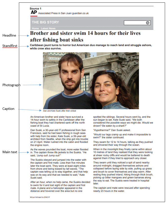
This is an online newspaper article about a brother and sister’s dramatic swim for survival after a fishing trip went wrong. We have chosen a very simple design here to get you started.
Firstly, write down the four main headings for presentational features:
Layout
Pictures
Colours
Text
To remember the list, use the mental image of the woman who lay outside on a newspaper, taking pictures of the colours in her garden, and being covered in text when she stood up.
Now write down the list of effects headings:
Understand
Sense
Respond
Remember
To remember these four headings, revisit the story in the section on Language Features about the special effects expert who handed the exam results to her daughter (under the heading How to remember the effects).
Now, consider each of the presentational features in turn, as follows, writing down what effects each features has had on you.
1. Layout
Under this heading, make notes about the way the component parts of the page have been arranged. The components in this first example are:
- Headline
- Standfirst
- Picture (with caption)
- Main text (two adjacent columns, short paragraphs)
It might help to annotate the source; write on the source page - the name of each presentational feature you find – with the exception of “Layout”, which is, of course, the whole thing.
Does the arrangement of the parts lead you into the text? Is the headline prominent enough to catch your immediate attention? Does the picture have impact? Do you have to search for anything, or is there a natural, logical order to everything?
EFFECT: Does the layout help or hinder you? Did you get straight into the information provided without any problems? Was the starting point for reading clear? Did headline, standfirst and text follow each other logically; overall, did the layout aid your understanding and memory of the information? Did it appeal in some way to your senses, and did you respond positively or negatively?
2. Pictures
Under the heading “Pictures”, make notes about the use of all the pictures on the page (for simplicity in this first example, there is only one). Does the picture have impact – is it prominent enough? Is it positioned for maximum effect? Has it been distorted (i.e., stretched on one direction or another) to make it fit?
EFFECT: Was the picture the first thing you looked at on the page? Did it make you want to read about the people in the picture? What effects did it have on your understanding and senses? Did it aid your understanding and memory (remember) of the information provided?
3. Colours
No textual or graphical colours have been used in this very simple web-based news page, unless you count the grey “BIG STORY” label at the top. That doesn’t mean you cannot comment. For instance, you could note that some use of colour might have made the page more attractive. However, it is true that news pages are generally less colourful than some other types of page as they are functional in order to present information quickly and clearly.
EFFECT: What is the effect of the lack of colour here? Did it make the page stark and unappealing, or did it allow you to concentrate on the words and picture without distraction? Overall, did it affect your understanding or your ability to remember the facts?
4. Text
Remember, we are including ALL the words on the page in this, not just the body or main text.
Start at the top, with the headline. Is it sufficiently large to attract attention? Is it in a readable font (typeface)? Does it match or contrast with other fonts on the page?
Moving on to the standfirst, is it sufficiently large to be very readable? Does the choice of typeface make it easy or hard to read? Does it match or contrast with other typefaces on the page?
Looking at the caption, again, is the typeface sufficiently readable? How does it compare to other typefaces on the page? Is it in a different typeface to distinguish it clearly from the main text?
EFFECT: Make notes on how the appearance of the text on this page has affected you overall. Has it helped with your understanding of the information, and with your ability to remember the facts?
Answering the question
Remember, the question will be something like:
“Look at source X and define the ways in which presentational features have been used for effect.
Remember to:
- write about the way the source is presented
- explain the effect of the presentational features”
Here’s how we answered the question (remember, the text in red is for your guidance only, and should not be included in your the actual answer) :
Brief introduction
This is a functional, very straightforward news page from the web about a brother and sister escaping possible death after a fishing boat incident. It is very readable and the headline, picture and standfirst work well in drawing the reader in to the story.
Presentational feature: layout
The layout is simple, clear and well-ordered. The headline at the top, followed by the standfirst, leads into the photograph and the text. The photograph is large and impactful.
Effect: understand, remember
The effect is to make absorbing the information very easy for the reader – there is absolutely no impediment here to reading and understanding.
Presentational feature: picture
Short of flying the brother and sister back to the Caribbean and asking them to re-enact the drama, there’s really no option other than taking a rather normal photo of them together – which is what we have here. It is pleasing that the photographer has apparently not asked them to hold up their fishing gear or point to where the incident happened on a map of the Caribbean, which is sometimes the crass approach taken by newspapers. We just want to know what they look like – and this fits the bill admirably. I actually looked at the picture before I read anything – I think most people do that when news pictures are displayed so prominently. It is positioned centrally and between the standfirst and main text, making it the most noticeable feature on this page.
Effect: Respond
The prominent display of the picture makes an immediate impact and the reader responds by wanting to know more about these two people.
Presentational feature: colours
Apart from the picture, everything is monochrome on this page. Some use of colour might have made the page more attractive. However, news pages are generally less colourful than some other types of page as they are functional in order to present information quickly and clearly.
Effect: Understanding
The monochrome approach has actually added to readability and therefore understanding – colours might create the wrong mood for a serious news item and therefore distract from, or even impede, a full appreciation of what is being reported.
Presentational feature: text (headline)
The headline works well, because it’s rooted in a real-life drama that needs no embellishment to capture the reader’s imagination, fear and empathy. It’s the biggest font size on the page, and positioned at the top, which makes it conspicuous and very readable, as it needs to be.
Effect: respond
The position and size of the headline make it one of the two most noticeable features of the page (the other, of course, is the picture). The reader responds by following the cue – it leads naturally to the standfirst and text below.
Presentational feature: text (standfirst)
The standfirst immediately below the headline is a brief summary of what happened; it fills in a little more information – for instance, where it happened and the fact that the crew also survived – but chiefly this is another device to draw the reader in. This standfirst is in a different font – sans – compared to the serif type used in the headline, which provides contrast without jarring.
Effect: respond (reader wants to find out more)
Positioned prominently beneath the headline, the standfirst is unmissable. It is therefore able to fulfil its function of setting the scene and making the reader want to find out more.
Presentational feature: main text – short lines and short paragraphs
The text is in two columns, which shortens the lines, and the paragraphs are also short. There’s a small amount of white space between each paragraph, which, in the absence of sub-headings, makes the text look less like a slab.
Effect: Understand
The short lines, short paragraphs and white space make the text more inviting and easier to read, therefore aiding understanding.
Presentational feature: text (fonts)
The designer has chosen a serif font for the main headline, which is also emboldened, and sans for the standfirst (again emboldened), caption and main text. This is an excellent combination. Limiting the number of typefaces on a page is sensible – it avoids clashes and the possibility of overwhelming the reader with different styles.
Effect: Sense, understanding (clarity)
The serif font for the headline gives an air of seriousness to the online publication. The sans type for smaller text makes it very readable on a small screen.
