Answering the Question
Example 2
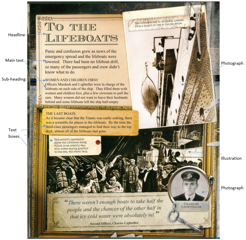
This a page from a book for children about the passenger liner Titanic which sank in 1912 with the loss of more than 1,500 lives.
Firstly, follow the procedure as in example 1, writing down the four main headings for presentational features, followed by the four main headings for presentational feature effects.
Annotate the source material (the page) with the names of each presentational feature you find.
Again, consider each of the presentational features and make your notes. At the end of each, write down what effects the features have had on you.
Answering the question
Remember, the question will be something like:
“Look at the source ‘To the Lifeboats’ and define the ways in which presentational features have been used for effect.
Remember to:
- write about the way the source is presented
- explain the effect of the presentational features”
Here’s how we answered this question:
Brief introduction
This printed page from a children’s book, highlighting the problems of not having enough lifeboats on the Titanic and failing to fill all the available space in those they did have, has an antique look about it, in keeping with the period of more than 100 years ago. The yellowing paper effect lends a sepia tone to much of the page, very evocative of the early 20th century.
Presentational feature: layout
Some items look as if they have fallen onto the page, overlapping other items and giving a 3D effect. The magic is that, although the arrangement looks almost accidental, is has actually been very deliberately designed to give this effect, without compromising readability and understanding.
Effect: understand, sense, respond, remember
The layout is effective on every level – it aids understanding by being logical and easy to read; it appeals to the senses through its antique, sepia appearance; it makes the reader respond by being able to visualise the scene; the placing of text in a series of box shapes makes for easy reading with natural pauses; and, finally, the images and the clever way some of them are framed makes this a most memorable page.
Presentational feature: headline
The headline – “TO THE LIFEBOATS” – is in a decorative font, again the kind I would associate with the era concerned – the early 1900s. Apart from the images, it is the most noticeable feature on the page – it is meeting its requirement as far as size and position are concerned.
Effect: sense, respond
It evokes the period and performs as a perfect “start signal” for the reader to respond by diving into the text below.
Presentational feature: pictures
The use of pictures on this page is quite ingenious. The picture of the lifeboat at the top right appears to have just fallen onto the page, being at a slight angle. It has “landed” partially on the gilt-framed impression of the women in the lifeboat saying farewell to their menfolk. Second Officer Lightoller’s image is cleverly set in a keyring bearing a key of the era.
Effect: Understanding, sense
The pictures aid understanding of some of the facts – for instance, the perspective of the lifeboat picture at the top right really brings home how far the boats had to be lowered to reach the sea. Eighteen metres is just a figure – but seeing is believing! Generally, the way these pictures have been used makes it seems that I am looking at real artefacts rather than a two-dimensional page.
Presentational feature: typefaces
All of the text uses a serif font, with relief provided by what looks like typewritten text (Courier) for captions, and italics for a quotation at the bottom of the page.
Effect: sense
The overall effect of the font choice is to make the page look historical, even slightly solemn. Serif fonts are often associated with serious subjects and are used for both headings and body text in serious newspapers. The designer has made the right choice to create the appropriate mood for a book about the Titanic disaster.
Presentational feature: main text
The main text is in two paragraphs, with a sub-heading (capitalised body text) providing a visual break. The first paragraph is set in a slightly larger size than the second one. This is often done to lead the reader in – a larger typeface is easier to read. The length of the lines is relatively short (but not too short), which again makes reading easier.
Effect: Understand, remember
Because the arrangement and typography of the main text makes for easy reading, the reader can concentrate on the words, which leads to better understanding and retention.
Presentational feature: use of boxes
The headline and main text are contained in a box, which has decorative border to the top and left, which appears very much in keeping with the era. The strips of paper used for the text headed “THE LAST BOATS” and the quote at the bottom of the page are not strictly speaking boxes, but have the same effect, while also lending an almost 3D element to the design. The strip of paper and the tag used for captions have a similar effect – the tag in particular being evocative of a ship, where luggage and other possessions would be tagged.
Effect: understanding, sense
The clever use of text boxes provides easy reading. Information can be assimilated from each box with a pause in between, so reading never becomes a chore. These boxes also lift the page, giving a 3D effect which is pleasing to the eye.