Linking presentational features and effects
Below, we describe each of the presentational features in more detail, and show you what effects each may have on the reader:
LAYOUT
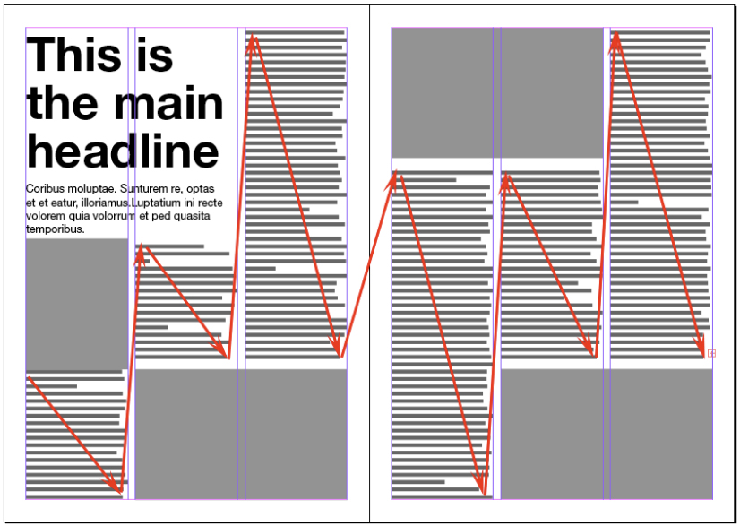
This is the way in which the component parts of a print job or web page are arranged, or “laid out”. The components can be:
- headings (titles)
- standfirsts (short summaries of main text)
- sub-headings (small headings that break up long columns of text)
- pictures
- main text
- coloured elements (type, lines or backgrounds)
- bullet points
- boxed text
- columns (“legs” of text)
- lines (sometimes called rules)
- call-outs
- pull-quotes
EFFECTS: Layout is important for the visual appearance and overall appeal of the printed material or web page (sense, response); it’s also important for the order and clarity of the components (aiding understanding). If information is provided logically and in the right sequence, layout will also have a major effect on our ability to remember what we’ve seen and read.
PICTURES
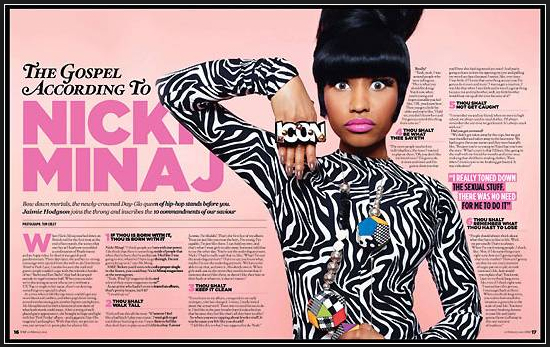
By pictures, we mean both photographs and illustrations. They make published material look more inviting, add interest and information. An effective photograph or illustration can show the reader details that might be difficult to describe in words, and make information much more memorable.
EFFECTS: Well-chosen photos and appropriate illustrations can obviously appeal to the senses, depending on subject; they can also provide visual information that is sometimes less easy to convey in words, and so can aid understanding. Pictures such as those taken in war zones or refugee camps can clearly cause the reader to respond with horror, dismay, sadness and so on; while other photos might bring a joyful response. A great photo or illustration can so obviously help the reader to remember – in fact, your memory of a photograph might be the key to remembering the information that went with it.
COLOURS
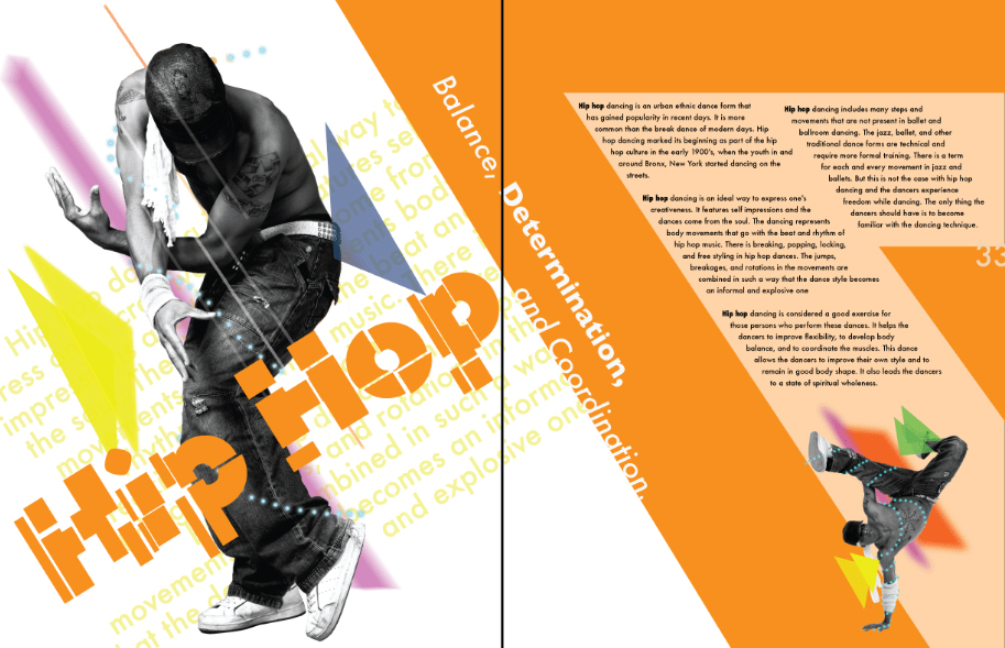
Pictures add colour, of course (unless they are monochrome), but we are talking here about colour that’s added by way of:
- Coloured text
- Backgrounds
- Boxes
- Lines (or rules)
and possibly other shapes that the designer produces. Some of these may have text over them, others may be there as breakers (to break up slabs of text), pointers or just to make a pleasing design.
EFFECTS: If the primary aim of using colours on a page is to attract attention, this is an obvious appeal to the senses. However, another major use of colour is to categorise or group items on a page, or to link between different components. For instance, a “map” of the new Parliament after an election might reflect the colours of the political parties, so you get an immediate idea of how the parties measure up. In this way, colour can add to your understanding and help you remember.
TEXT
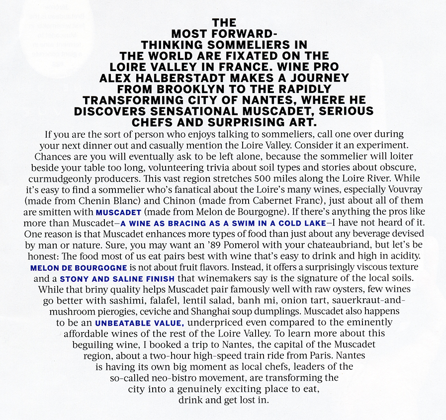
Text is the main body of words in a leaflet, magazine or newspaper article. Some designers like to make interesting shapes out of text, as in the example above. It’s where you get the full details of what the writer and designer of the printed work want you to know. However, we are also including all the other words – such as headlines, standfirsts, sub-headings, call-outs and pull-quotes – under this heading as all are quite clearly a kind of text.
EFFECTS: Headlines are designed to draw the reader in to the information or article, and so are clearly intended to get a response from the reader.
Standfirsts provide a summary to whet the reader’s appetite, and so again are designed to get a response.
Sub-headings, apart from indicating the substance of the text beneath them, act as a momentary pause, break or rest for the reader. This may encourage the reader to continue, which helps with understanding.
Call-outs and pull-quotes generally make a layout look more appealing (senses) and if they are sufficiently interesting may also act as an enticement to read the full article, so aiding understanding.
