Alignment – The positioning of visual elements so they line up in a composition, be it text or an image
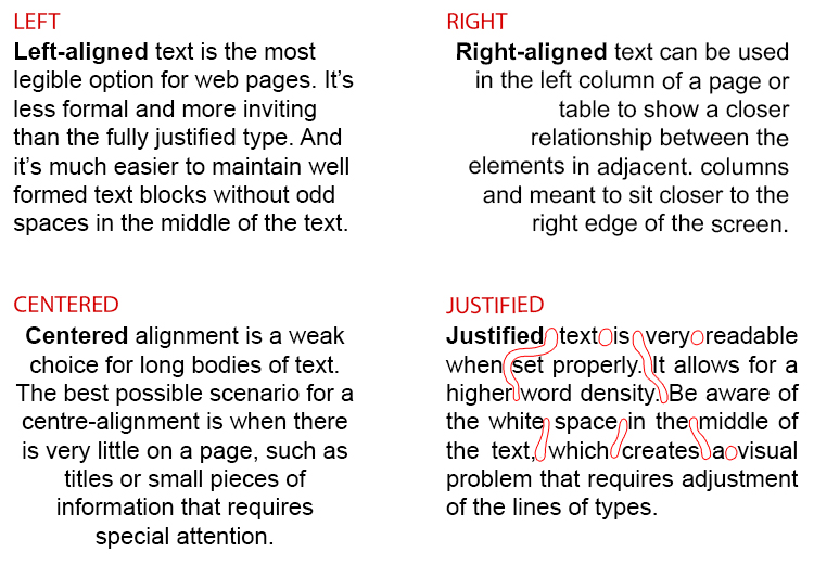
Note: in text, words can be aligned to the left, right or centre, or both left and right (also known as justified).
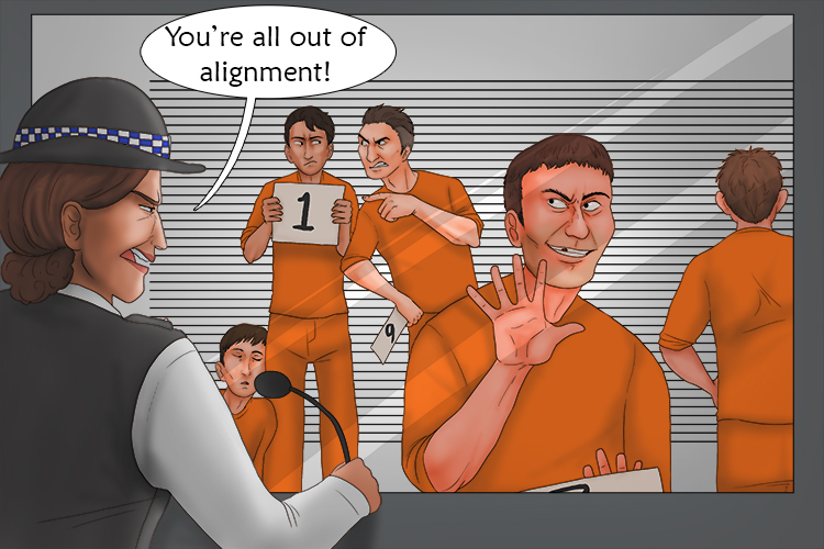
To remember what alignment is, recall the following mnemonic:
They were supposed to be in a line, it wasn't meant (alignment) to be all over the place.
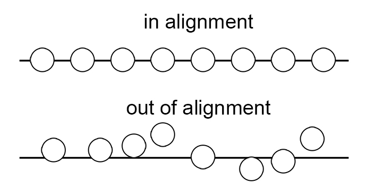
Below is one way of aligning a visual image:
Here is a text alignment:
But, alignment in graphic design is the foundation upon which your design stands and appears attractive to the viewer. Alignment is the arrangement of different design elements to declutter the design. No one likes a design with scattered text and misaligned graphics.
Alignment Project
For this project, we are going to create a business card for the brand we designed in the branding project.
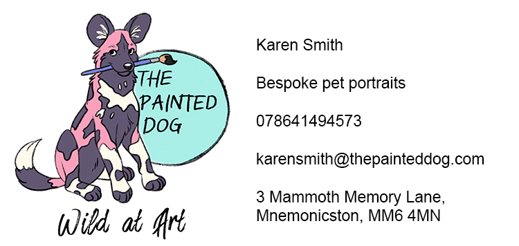
We already have our business name, logo and slogan, but we also need to include some other information. Below are all the elements we need for our business cards. (We're using fake information).
Business cards are generally two sided, with the logo on one side and information on the other. You could just use one side, you could lay out all your information and your logo as it is above, it shows everything you need. However, it is boring, badly laid out and not at all eye catching. You probably wouldn't look at it twice.
Business cards are usually 85mm by 55mm, so try to stick to those dimensions. This will need to be created digitally to get the best results.
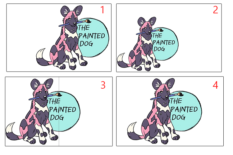
We will start by designing the front of the business card. Think about which alignment will look best for your logo? And how big will it need to be?
Too far in either direction and the logo looks off (1 and 3). Too small and there is too much space around the logo (2). Usually putting the circle in the centre is the best way to go (3), but it puts the design off balance. Putting the right edge of the dogs face in the centre makes the design look more balanced and central (4).
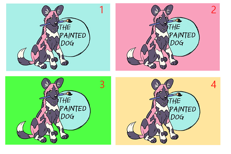
Now we have found the placement for our logo, we need to add background colour as white is just not that interesting! The blue (1) and pink (2) from the logo just envelop the drawing and nothing stands out. Trying overly saturated colours (3) just clashes horribly, but a light yellow compliments the blue, pink, purple and white of the logo without taking anything away from it (4).
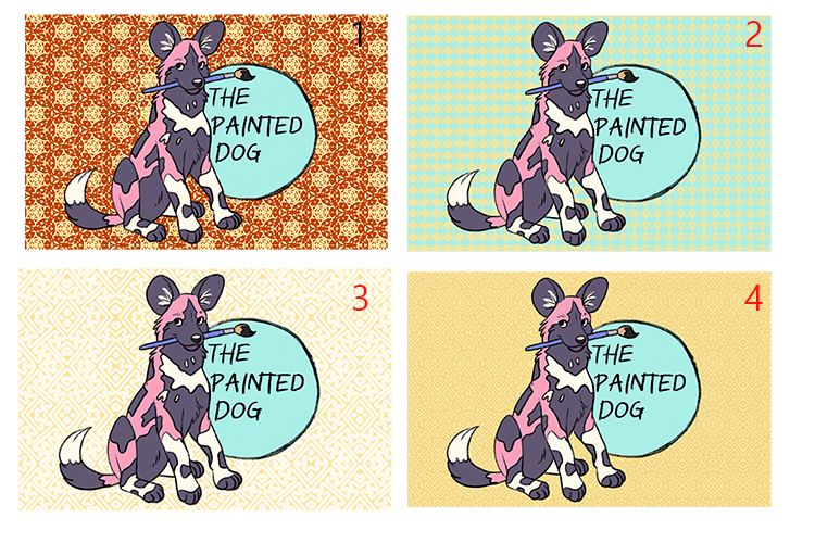
Business cards often look better with a subtle pattern to give them texture. Don't go overboard. On the first design (1) the pattern is far too dark and makes the card look cluttered and unpleasant to look at. The second design (2) uses too much blue and takes away the contrast with the logo. The third design (3) is a little better, but it's verging on too bright. A colour just a few shades darker than the yellow works well on the fourth design (4). Add the same pattern to the back of the card in a slightly darker shade too so it matches.
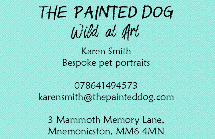
Working on the back of the business card for the information, we need to find a font. It needs to be clear, but not boring. A font such as Jokerman (1) is useful for some projects, but it would be almost unreadable on the back of a business card. Mistral (2) is often a workable font for a small business as it gives a more personal, handwritten feel, but you want the information to be easily read. Times New Roman (3) is a very common font, but it is quiet severe and isn't quite the look we want to go for. Finally, we have chosen Maiandra GD, as it is easily readable but a more rounded and kinder font.
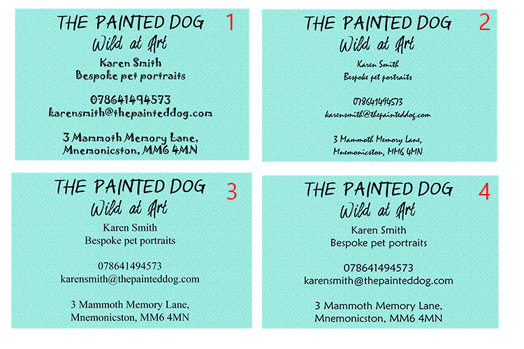
We have tried a few different text alignments and we feel none of the below work. 1 and 3 have the potential to work, but are far too text heavy on one side with nothing to balance it out on the other. Attempting to fix the problem, we tried style 2, which was awful, the eye is drawn all over the place and it can't be easily understood. We find 4 technically pleasing to the eye, everything is pretty equally spaced and symmetrical, but the information now looks like nonsense.
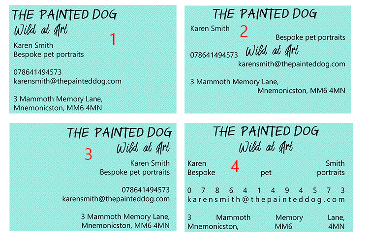
We feel the alignment we used for the font examples is actually the best one, so we have chosen to go with centered alignment.
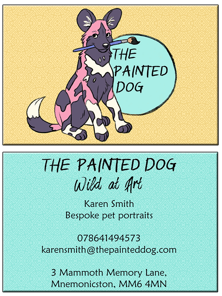
Below are our finished business cards! You can either print your cards out yourself or if you're able, use an online company who can produce professional business cards.
Alignment.