Logotype – a symbol of the company in customised letters
(Pronounced loh-goh)
First, you need to remember that logo means "symbol" by recalling the following mnemonic:
Low is the only way to go through this room because there are cymbals (symbol) in the way.
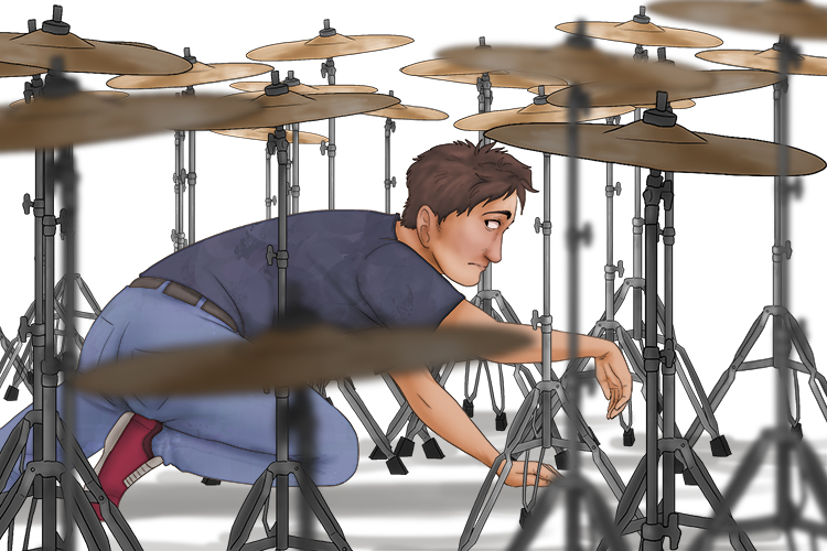
Type reminds you of letters that a word processor or publishing program can produce. Therefore, logotype is a symbol of the company in letters.
A logotype is a graphic element that is used to identify an organisation, company, corporation, or even a product or service. Logos are symbols which help to create an identity for an organisation or reinforce a product brand, so that they are memorable and more easily recognised.
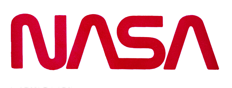
The NASA logotype (affectionately known as the NASA worm) is a very simple, but memorable example of logotype. The logo was retired in 1992, but was brought back into use as of 2020. The lack of horizontal line in the "A"s represent the tip of a rocket.
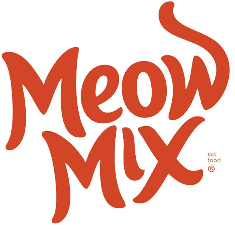
The logotype below belongs to an American cat food company. While at first glace it may just look like the name of the brand, if you look more carefully you can see that it forms the shape of a cat, with first M creating the ears, the EO the body, the elongated W making the tail and the second M and X representing the legs.
Logotype Project
For this project, we're going to create our own logotype.
The logotype we are designing will be based on our fictional outdoors and climbing equipment business which we have called Lemur. We decided on this name because we feel an athletic creature who lives in the treetops would suit an outdoors brand.
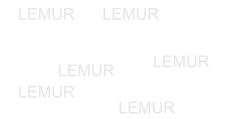
Start by printing off the word "lemur" in a basic font (such as Arial) in a low opacity (so it's easy to draw over). You can always print out more later if you need to.
Sketch some ideas, try to think of ways you could incorporate physical features such as the long black and white tail into the design.
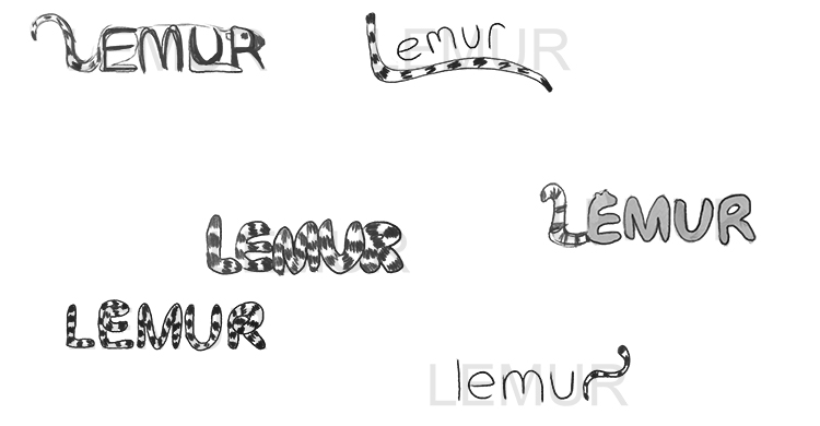
We have chosen the middle right design. Joining the L and the E together and adding little ears to the E give the impression of a lemur without disrupting the word too much. Sketch the letters in pencil onto a fresh piece of paper. Add fur on the letters by drawing jagged lines.

Once you're happy with your sketch, you can go over the lines neatly in pen and then erase the pencil lines.

If you photocopy the pen lines and print out a few copies, you can experiment with different designs without having to redraw it every time.
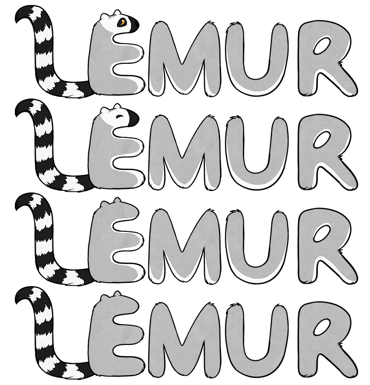
Decide which one is your favourite. We have chosen the second one down as we think the eye on the top one is quite distracting, but the others are too plain. The second one is neither too distracting or too plain.

Logotype.


