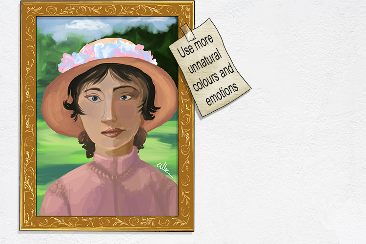
Post-Impressionism – An art movement at the end of the 19th century that followed on from impressionism and included Cezanne, Gauguin, Van Gogh and Georges Seurat
(Pronounced pohst im-presh-uh-niz-uhm)
Note: Post-Impressionism took Impressionism and went even further away from realism, concentrating yet more on emotion, even using unnatural colours.
To remember the meaning of Post-Impressionism, recall the following:
She posted a note on the impressionist's (post impressionism) painting which said: "Use more unnatural colours and emotions".
For this exercise, you'll need a black and white photocopy or print and some colourful acrylic paint.
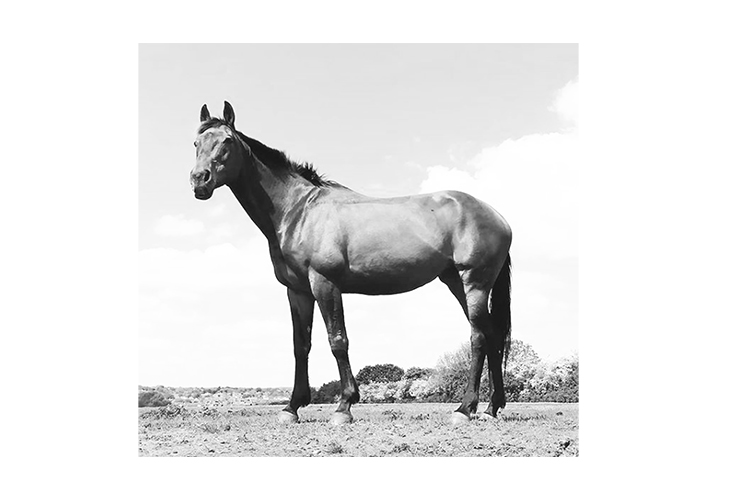
Start by painting over the print, try using warm colours in the light areas and cool colours in the dark areas. Follow the contours of the shape with your brush strokes.
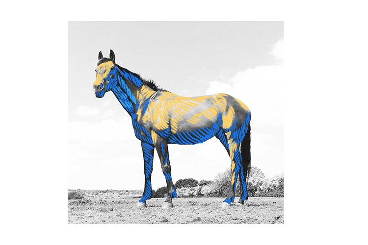
Layer the colours over the top of each other. If you don't like how the colours look, wait until the paint is dry and then go over the top with another layer of paint.
Layer the paint until you're happy with your work.
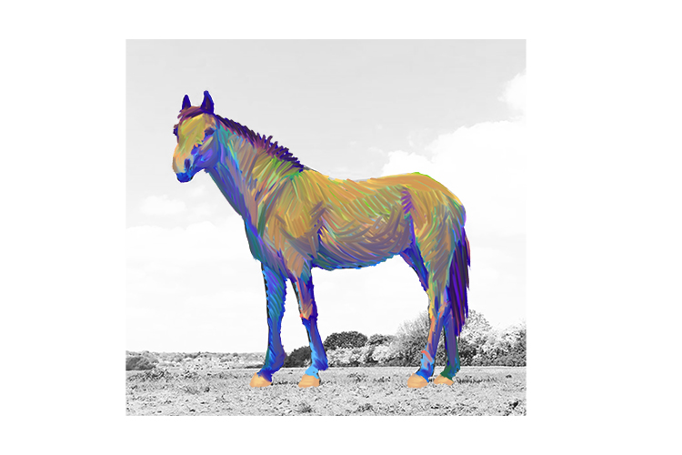
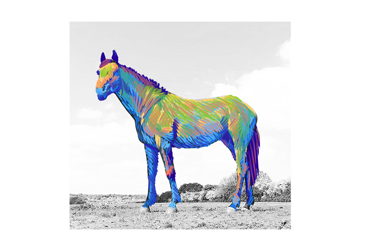
Finally, add a background with the same technique.
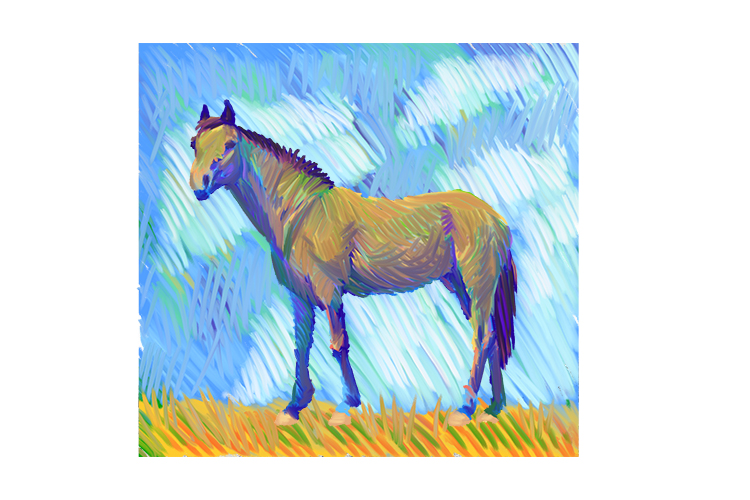
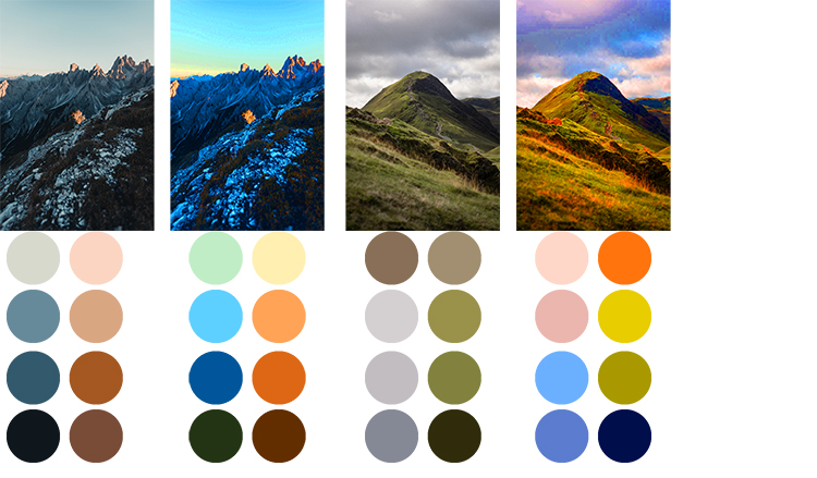
If you print the black and white image you start with from a digital colour photograph and you have image-editing software, you can digitally edit the saturation on your photo to make it more vivid and maybe even change the hue slightly. You can see how doing this will make your colour palette much brighter and show you colours you might not have even thought to use.
Another method to try is to load the brush with several colours at once. This works particularly well when painting flower petals.
With thick black lines, sketch a picture of your favourite flowers.
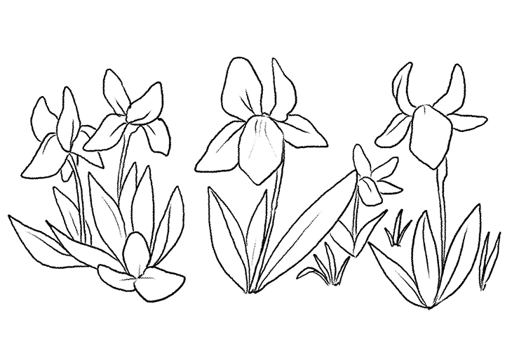
Load the brush with 3 or 4 colours at a time for the petals of the flowers and use 2 or 3 shades of green and yellow for the leaves. Do this by simply dipping the brush into your different coloured paint. The last colour you dip will be the first onto the paper. How much of each colour you use is up to you, but why not try experimenting?
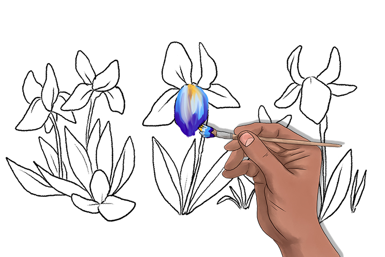
Try some different colours for the petals, washing your brush between each new set of colours so you have bright clean colours each time and don't end up with muddy brown paint.
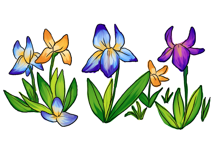
Once all the flowers and leaves are painted, fill in the background with muted oranges and browns for the ground and pale greyish greens and blues for the grass in the far background.
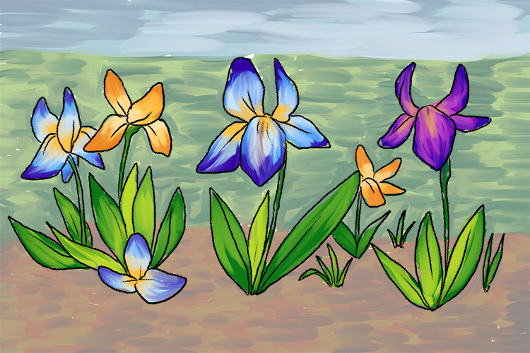
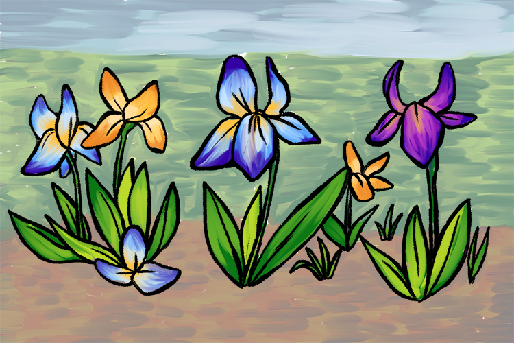
Finally, redraw the outlines so they really stand out.
Post-Impressionism.