Commercial art – art for commercial purposes, primarily advertising, to sell products, services and goods
(Pronounced kuh-mur-shuhl)
Note: Commercial art traditionally includes designing books; advertisements for various products; signs; posters; and other displays to promote sale or acceptance of products, services or ideas.
To remember what commercial art is, recall the following:
Commerce shall (commercial) always find a way of using art to sell products and services.
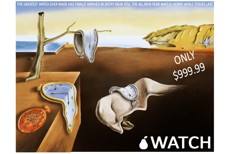
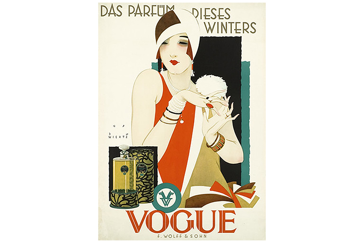
Art has been used to capture the eye of potential customers of products for many years, with advertising posters featuring interesting and appealing works of art.
The acceptance of products in artwork has also been present for generations, with artists such as Andy Warhol using brands in some of their most famous works.
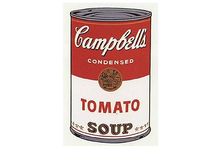
Andy Warhol, Campbell's Soup I, 1968
Commercial Art Project
To create a piece of commercial artwork, try producing a poster or sale image for your favourite branded product.
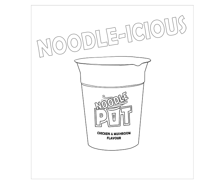
For our example, we will show you, step by step, the stages of creating a poster for a Noodle Pot.
The first step in the process is to draw an outline, in the centre of a page, of your favourite product.
You can take the product and draw it from life or use a photo of the product and the Mammoth Memory grid method to copy it onto your page.
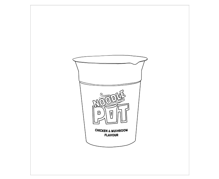
Once you have the product outline in place, you can work around it to build up an interesting and striking design.
Text is an important feature in commercial art. Product names, information, pricing and slogans, along with other information, are often included. Try adding a bold, striking word in your image. It can be the brand or product name, or just a word that relates to the product.
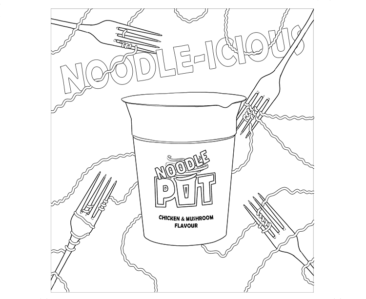
Now your text is in place, we can start to make the image more striking. Add interesting imagery around the central object, but keep it simple, as you want the product itself to be the focus. We have added fork shapes and noodles to ours.
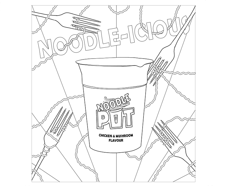
Rather than a plain background, mark out the layout for a patterned background, or one with an interesting feature, like the lines we have used that almost look like rays of light.
If you are happy with the design you have created, use poster paints, or gouache (available in craft shops) to colour the image. These paints work well as they are matt, and do not create washes like watercolours.
Rather than blending in any shading with a gradient, alternate between a dark tone and light tone for each ray. You can use the Mammoth Memory Value page to help work these out.
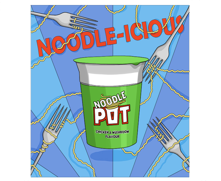
Commercial art.
