Logomark – a symbol of the company that doesn't contain the business name, designed in a customised way
(Pronounced loh-goh)
First, you need to remember that logo means "symbol" by recalling the following mnemonic:
Low is the only way to go through this room because there are cymbals (symbol) in the way.
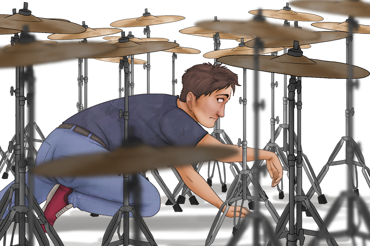
"Mark", in the word logomark, reminds you that there are no letters. Therefore, a logomark is a symbol of a company and doesn't usually contain letters.
A logomark is a graphic element that is used to identify an organisation, company, corporation, or even a product or service. Logos are symbols which help to create an identity for an organisation or reinforce a product brand, so that they are memorable and more easily recognised.
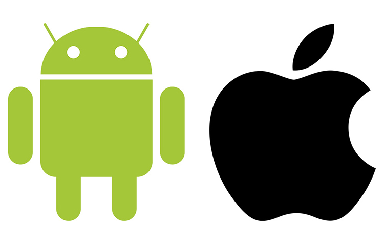
The above are two of the most well known logomarks for competing companies - Android and Apple. They are both phone (and other media) companies with often very loyal customers who wouldn't dream of straying from their favourite brand. Their simple designs make them instantly recognisable and memorable. Both can be used on merchandise where they can be easily seen (so people know which one you prefer).
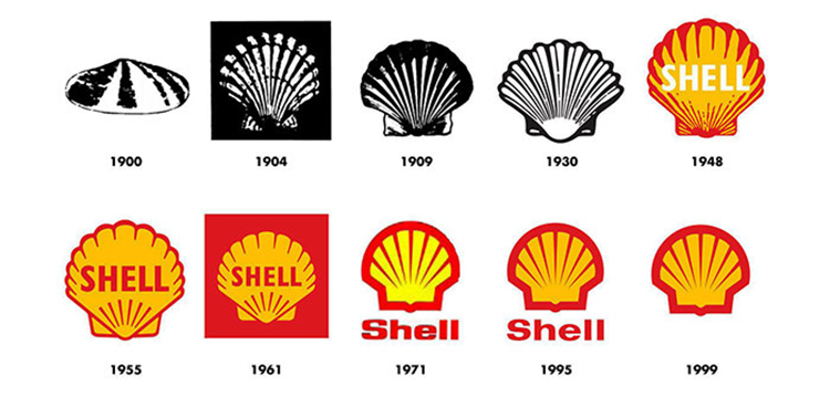
Logos don't always stay the same either, most evolve over time. The Shell Garage logomark (although some are combination logos - featuring the picture and the name) is almost unrecognisable from the 1900 logomark to the 1999 logomark, but from one design to the next there are very few changes and aside from dramatic changes from monochrome to colour, they might have gone unnoticed by the general public.
Logomark Project
For this project we're going to create our own logomark. We're going to think about the starting point of designing a logomark, and refine and simplify it until you have a modern design like the Shell logomark above.
Start by thinking about your brand and what you'd like it to be called and why. We know our business is going to be an outdoors and climbing equipment company, so we need to think about what would fit our image and represent our brand.
We have decided that the company name and logomark should be centred around an athletic animal which lives in the jungle in the trees. Monkeys are frequently used in brand names. We are going to use the word "Lemur" as our company name and use that word to create a great logomark as they have striking black and white tails.

Sketch the lemur in several different poses, get used to the anatomy and think about what pose might be an interesting starting point for a logomark. Maybe the tail could create a circle or the lemur could be running with it's tail trailing behind.
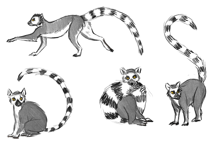
Break down the shapes of the lemur and simplify the designs.
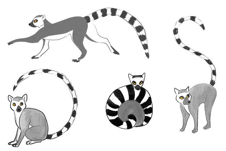
Push the simplification even further.
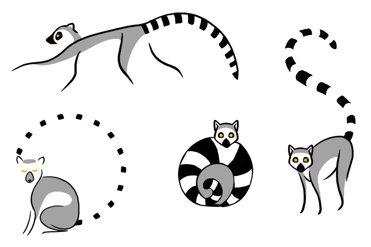
Choose your favourite design and think about any changes you could make to improve it. We have chosen the bottom left as our favourite, however we feel the face and the lines aren't quite right, so we're going to redraw it again with the same face as the two facing towards us, pupils in the eyes and thickening the lines a little.
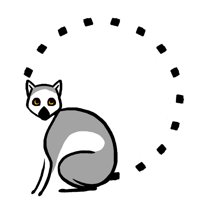
We feel this final design is eye catching, simple and easy to remember and would look great on a variety of products.
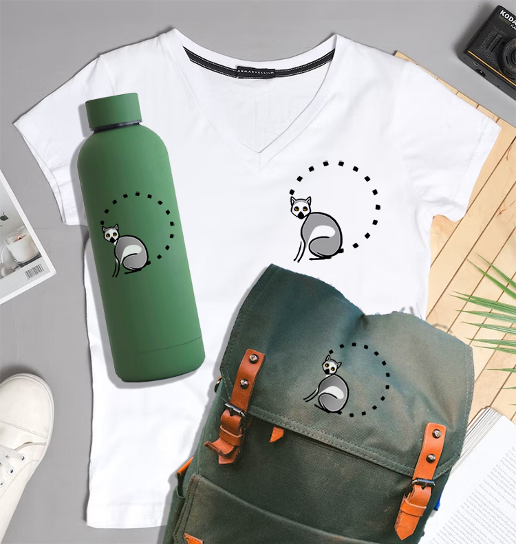
Logomark.


